In summer 2017, we realised we had outgrown our brand. We had a set of tools – a mark, colour palette and typeface – but they didn’t reflect the spirit of our company.
What changed
We began creating places to live in 2010, after experiencing the challenges of finding somewhere to call home in the city. We’ve always believed that by living, growing, and sharing experiences with others, we can live more fully. We started by offering 4 to 6 bedroom house shares and worked our way up to successfully developing and launching the world’s largest co-living community in May 2016, The Collective Old Oak, a place over 550 people call home.
But times were a changing, and we were growing up. In a matter of years we’d grown from a London-based start-up to a global leader in the co-living space. With new spaces on their way in London, the US and Germany we knew we needed a brand that would channel the ambition of our vision and the energy of our community. A brand that felt like us.
The Choice
We knew this would be a big project, so we decided to bring on an agency on to help. Picking the right partner was a big deal. We needed someone who really ‘got’ the challenges and complexities of pioneering a new way of living together.
When we met DesignStudio, we knew they were it. They’d worked on some of the worlds best-loved brands including Deliveroo and Airbnb, and they understood what we really needed: a design language that would empower our team to create continuous journeys throughout our world. A brand that would flow easily across the physical and digital, and which would support everything from our graphics to how we think about designing our buildings.
How we did it
We started off by inviting DesignStudio to sleep over for a few nights at Old Oak, to experience first-hand what it felt like to be a Collective member. We ran workshops together, and they had lengthy chats and interviews with our community, from our team to our members.
Next we wandered the Barbican while pondering architecture that has challenged the status quo. Designs whose biggest legacies have come less from their form than what the people living there have brought to them. Because joining The Collective is about being a part of something, and making it your own.
We considered collectives, groups and gatherings that have changed the world, from the Young British Artists to Burning Man to the Beatles. Because we’re not just about the shared spaces, kitchens, gyms, cinemas and bedrooms – we’re about connections, both macro and micro: random meetings, the waves hi and bye, the “how are you?” in the lift, the acts of kindness, the giving, the getting, the making.
We thought about how flexible a concept the idea of ‘home’ is, how it means something different to everyone. Home is a feeling. We thought about how that idea should feed into everything we do – from the way we design our spaces, to the room we leave for you to own your experience.
Creating our Collective identity
We landed on a simple design philosophy. ‘It’s the collective’. Take things and put them together and you have ‘a collective’. A representation of the power and magic of people, places and things coming together.
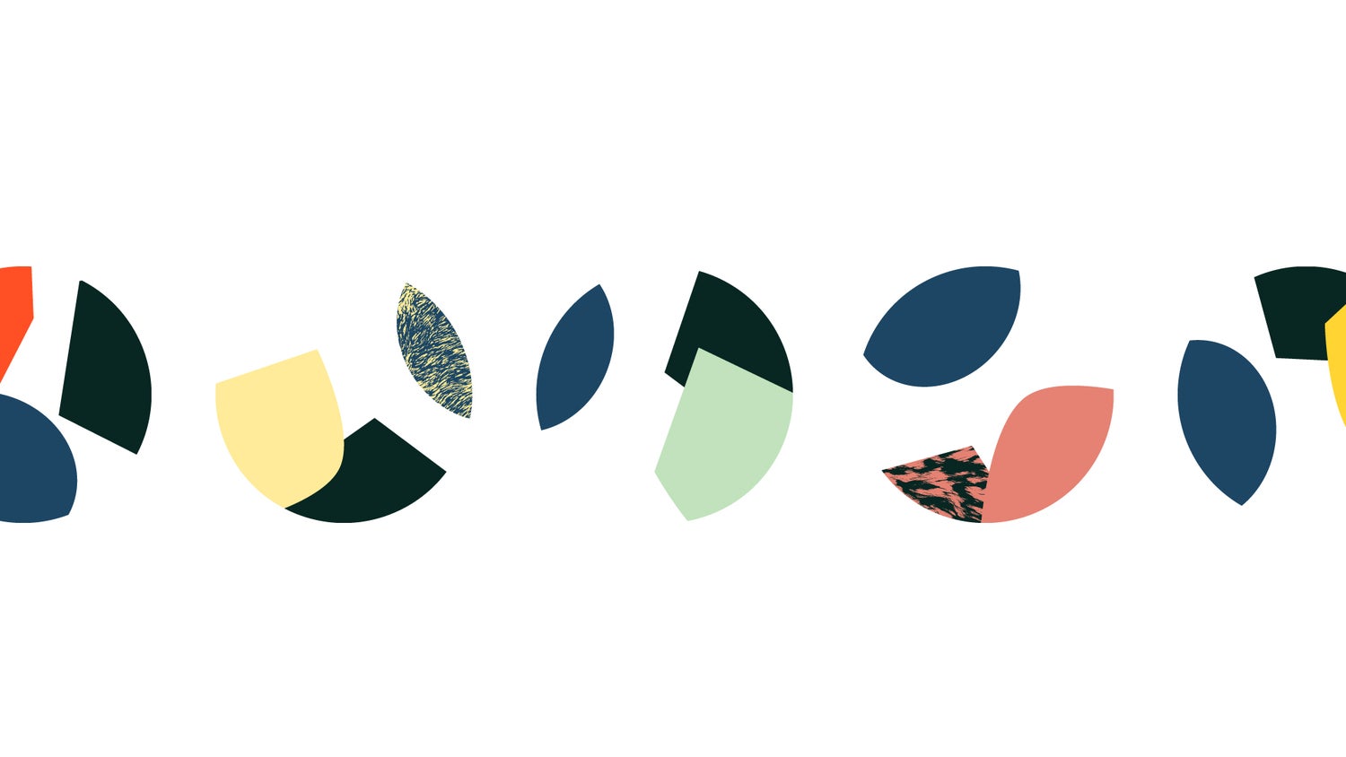
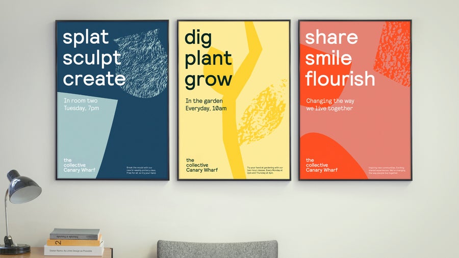
We worked with DesignStudio to weave this idea through our whole identity. We worked with Colophon Foundry to create a custom typeface with alternating characters that would reflect this uniqueness. We landed on an illustrative style that’s colourful, textural and vibrant, and photography that captures our people and spaces in a natural way. And we fed this idea of home through everything, from textures inspired by soft furnishings, to our interior design direction which is all about creating warm, welcoming spaces that are as eclectic as they are flexible to different people’s needs.
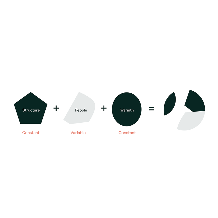
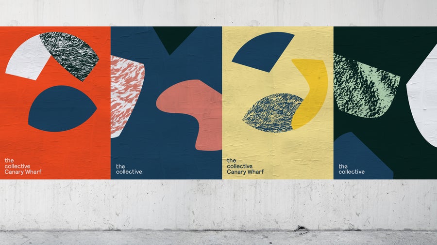
Then there’s our logo, our mark. Built from separate shapes, colours and textures, it symbolises things coming together to create something unique. Each of the shapes in our logo represents a core component of design and living:
· The pentagon represents structure – you might think of it as the building within the logo.
· The oval represents warmth – the space to make your experience living with us your own.
· The weird, abstract shape represents people – because it's our personalities that make us what we are.
It’s a symbol for people who want to connect, share experiences, and live fully.
We got to a simple design philosophy and a rule of threes, rooted in the brand’s very name: two’s company, three’s a collective. It’s an approach that combines different forms, textures and colours to represent the diverse characters and personalities that live and work there. The logo itself is warm and welcoming, combining three ergonomic shapes arranged into a composition that becomes more than the sum of its parts.
Campbell Butler, Creative Director at DesignStudio.
Our Illustrations
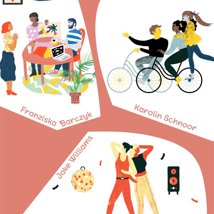
To honour the spirit of co-creation, we collaborated with illustrators Franziska Barczyk, Jake Williams and Karolin Schnoor on a series of commissioned illustrations that represent the diversity and character of our growing community.
Our brand platform
We also thought about our existing vision statement, ‘Alive Together’, which we drafted as a team a couple of years ago. Yes, it still made sense for us: it was about living and belonging. But we realised it was missing something really important.
Since opening Old Oak, we’d heard from so many of our members that by joining they’ve got something so much more than a place to come home to. They’d met different people and made friends for life. Together, they’d founded businesses, formed partnerships, fallen in love, gone on adventures and planned for the future. Together, they’d challenged themselves, learned and grown.
What makes joining The Collective so special is that here, you can be more together.
We design our co-living spaces to meet a need for real human connection and as we evolve our model, we’ve recognised the need to translate this across everything that we do. This includes our visual identity, which puts a stake in the ground for our future of our co-living projects. Working with DesignStudio has been enriching — especially to be an integral part of their process, which saw them immersing themselves in the co-living experience.
Reza Merchant, Founder and CEO at The Collective
This has been an amazing ride and we’re so happy to be sharing where we've got to. It’s just the beginning of our journey as the new ‘us’, and we’re excited to see what comes next. We hope you like it.
The Collective: Be More Together.
Like what you see? Well keep an eye on our Instagram, Facebook, Twitter and LinkedIn for sneak peeks and some awesome creative!